Youtube Video: A Year in the Life of Earth's CO2
2.1.19
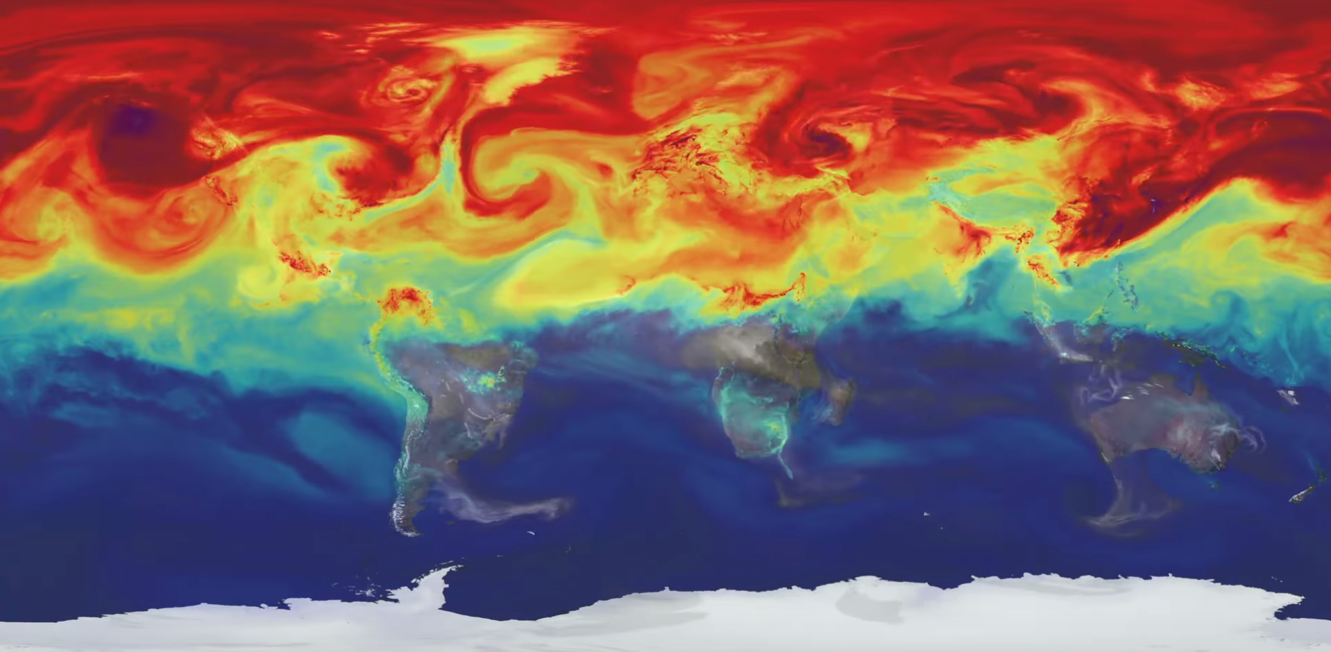
This video is narrated by Bill Putman, a research meteorologist at NASA Goddard, who works within the Global Modeling and Assimilation Office. It shows a high spatial and time resolution rendering of CO2 and CO in the atmosphere using data collected throughout the year of 2006. The model utilized is GEOS-5, with low levels of CO2 represented by black and then going from purple through the visible spectrum to red to white to pink as the concentrations increase. The CO2 doesn't stay at its emission source, instead it is carried across the globe by various wind patterns that end up swirling together. Within the video one of the first things that I noticed was that almost all of the CO2 generated near the Amazon Rainforest was almost immediately consumed in the same region. It looks like a clock, marking each 24 hours as the trees during the day consume CO2 during photosynthesis. This video begins on January 1st and runs for an entire year up to December 31st.
In the beginning of the year it is winter in the northern hemisphere and the CO2 isn't dispersed or consumed quickly. It builds up after being mostly generated around North America, Europe, and Asia. During the beginning of June the model shows that with all of the plants life that grows in the spring and summer in the northern hemisphere CO2 concentrations drop dramatically. But during the summer in the northern hemisphere it is winter in the southern hemisphere, which means it is the dry season. This dry season is the timespan in which many fire break out in South America, southern Africa, and Australia, and these fires release large amount os CO (carbon monoxide), shown in grayscale. As the seasons change back to winter in the northern hemisphere around September the CO2 starts to build up again. This is a completely normal cycle of CO2 concentrations and although the video's choice of red is alarming these higher concentrations are not inherently bad. It's detrimental because every year we are seeing more and more CO2 accumulate in the atmosphere because the Earth is not a big enough sink to adequately handle our CO2 emissions anymore. As CO2 is one of the most impactful greenhouse gases, this visualization is important so that the public can see the invisible way that the atmosphere connects us all.
It's interesting to see all of the corresponding wind patterns and how the tradewinds that we learned about in elementary school are right there on this simulation. I've watched a couple of other similar videos where they have shown dust, seasalt, and smoke and you can see how the dust from the Sahara travels all the way to North America and up to Great Britain as well. This dust phenomena is what caused the red skies over the UK. These videos released by NASA Goddard are fantastic as a window in aerosol modeling.